Spectral Sensitivity of Collodon Film
Spectral Response of Collodion Film
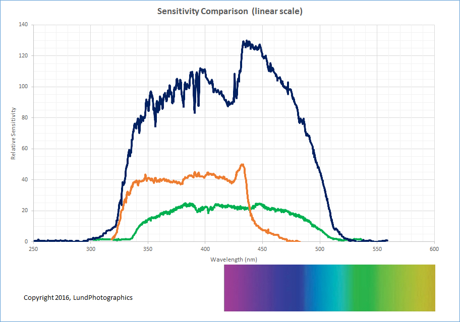
The spectral sensitivity of collodion is markedly different than what the eye sees. The chart below is a response profile taken from an actual spectrum captured on collodion film. A color spectrum is overlayed on the curve for reference. Note that the film's sensitivity extends far beyond the visible blue, into the region of ultraviolet (UV). Also note that the lower end of collodion's sensitivity begins to drop off in the middle of the visible spectrum, around blue/green. Thus, colors below green (i.e. yellow, orange, and red) will not trigger an actinic response in the film, thereby leaving those regions of an image containing these colors, black. Conversely, those regions of a scene that are highly reflective in ultraviolet will appear bright white in a collodion photograph even though they may appear dark to our own eyes in the original scene.
 |
||
| Collodion Spectrum | ||
 |
||
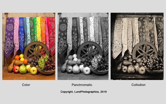
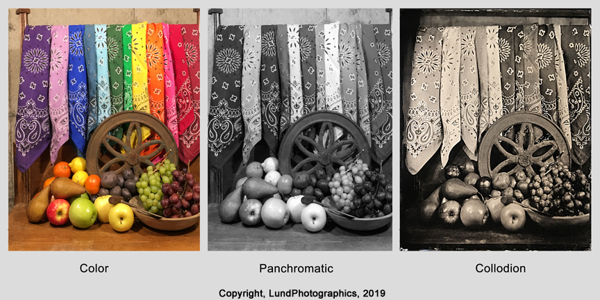
| Tonal comparisons between color, panchromatic, and collodion |
To illustrate this, a color photo was taken of a still life. The same image is presented as a panchromatic black and white image, and finally as a collodion photograph. Compare the blue fabric, oranges, and lemons when viewing the panchromatic and collodion images. The tonal values between these images are unexpectedly different. You'll see similar, but less dramatic changes with some of the yellows and greens.
If you've been paying attention, you might ask..."but what about the grapes and red fabric? They're not completely black in the collodion image... why not?" The fabric and grapes are indeed red in color, but the surface of these objects is also reflecting UV light which we are unable to see with our eyes. This reflected UV is what's recorded by the collodion film.